RIDER NBA
RIDER NBA




Descrição
RIDER NBA
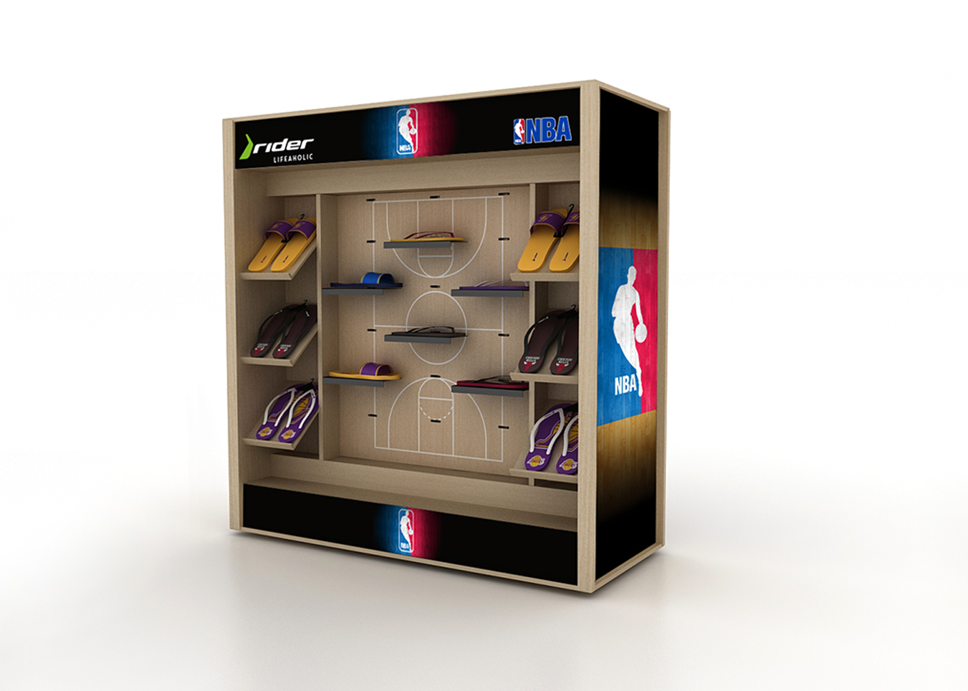
We were very happy when the Rider brand invited us to create the graphic standard and point of sale (MPDV) material of the NBA Rider line, after all we are of the generation who had an official NBA cap (with the correct number of seams and lining Green) was king. The brand made sandals from various teams such as flip-flops and gaspias (with no finger insertion) and it was up to us to create a retail harmony with an identity that conveyed the seriousness and authenticity of one of the American league with the largest number of fans in the world. Brazil is today one of the main consumers of this franchise.
Na That, by our DNA, we’ve never really been a fan of what we call “miniaturization of things,” ie mini basketballs, mini bowls, or mini athletes. We believe that the fan who trains any real sport never looks kindly on this sort of thing. In addition, the human “scale” factor is very important in all our projects. Therefore, the team decided to explore some concepts of the universe of basketball, focusing especially on the court of the game: the stage where the spectacle happens.
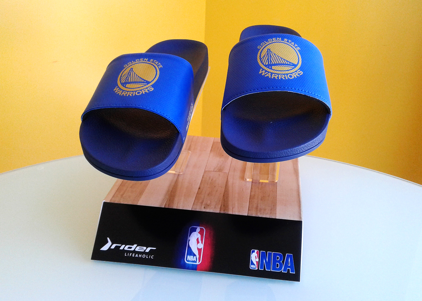
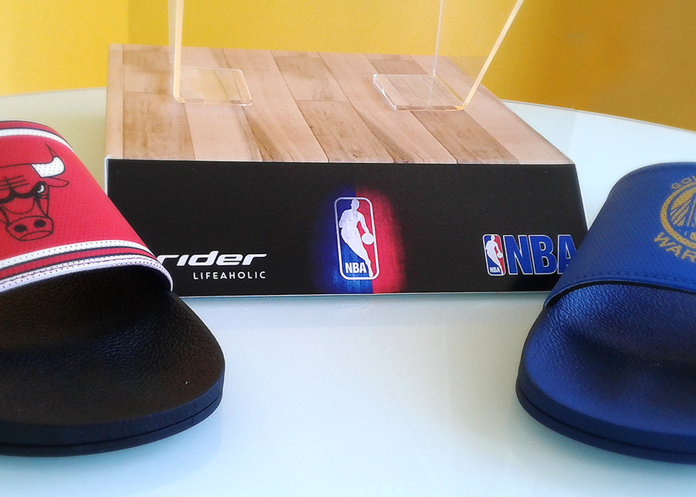
From the graphic line – with its spots, the special packaging all of fittings and that opens to form a block, passing through the display that simulates a jump for the pitch (with the Rider products) to the exhibitor that is literally in an inspired format On the bleachers of the game, it all comes back to this great sport that both excites fans who enjoy playing as much as just the basketball lifestyle. The result was a cohesive material, focused on the segment of sports stores and was very well accepted by retailers, both for the aesthetic and logistical factor. The product continues in sales in 2017 thanks to its success.
Descrição
RIDER NBA
Ficamos muito felizes quando a marca Rider nos convidou para criar o padrão gráfico e material de ponto de venda (MPDV) da linha Rider NBA, afinal somos da geração que quem tinha um boné oficial da NBA (com o número de costuras correto e o forro verde) era rei. A marca fez sandálias de diversos times como chinelos de dedo e gáspias (sem encaixe para o dedo) e coube a nós criamosr uma harmonia no varejo com uma identidade que transmitisse a seriedade e a autenticidade de uma da liga americana com maior número de fãs no mundo. O Brasil é hoje um dos principais consumidores desta franquia.
Na That, pelo nosso DNA, nunca fomos realmente fã do que chamamos de “miniaturização das coisas”, ou seja, mini bolas de basquete, mini cestinhas, ou mini atletas. Cremos que o o fã que treina qualquer esporte de verdade nunca vê com bons olhos este tipo de coisa. Além disso, do fator “escala”humana é muito importante em todos os nossos projetos. Assim sendo, o time decidiu explorar alguns conceitos do universo do basquete, focando especialmente na própria quadra do jogo: o palco onde o espetáculo acontece.
Desde a linha gráfica – com seus spots, a embalagem especial toda de encaixes e que se abre para formar uma quadra, passando pelo display que simula um pulo para o arremesso (com os produtos Rider) até o expositor que é literalmente em um formato inspirado nas arquibancadas do jogo, tudo remete a este grande esporte que tanto empolga os adeptos que curtem jogar quanto os que apenas o estilo de vida do basquete. O resultado foi um material coeso, focado no segmento de lojas esportivas e que foi muito bem aceito pelos varejistas,tanto pelo fator estético quanto logístico. O produto segue em vendas em 2017 graças ao seu sucesso.